The Home Front
From custom stair runner to Bauhaus-inspired rug collection
Collaboration has resulted in new product line by Supermarket Studio and Andrea Jae Studio.
By Rebecca Keillor
Vancouver Sun - Published Mar 10, 2026
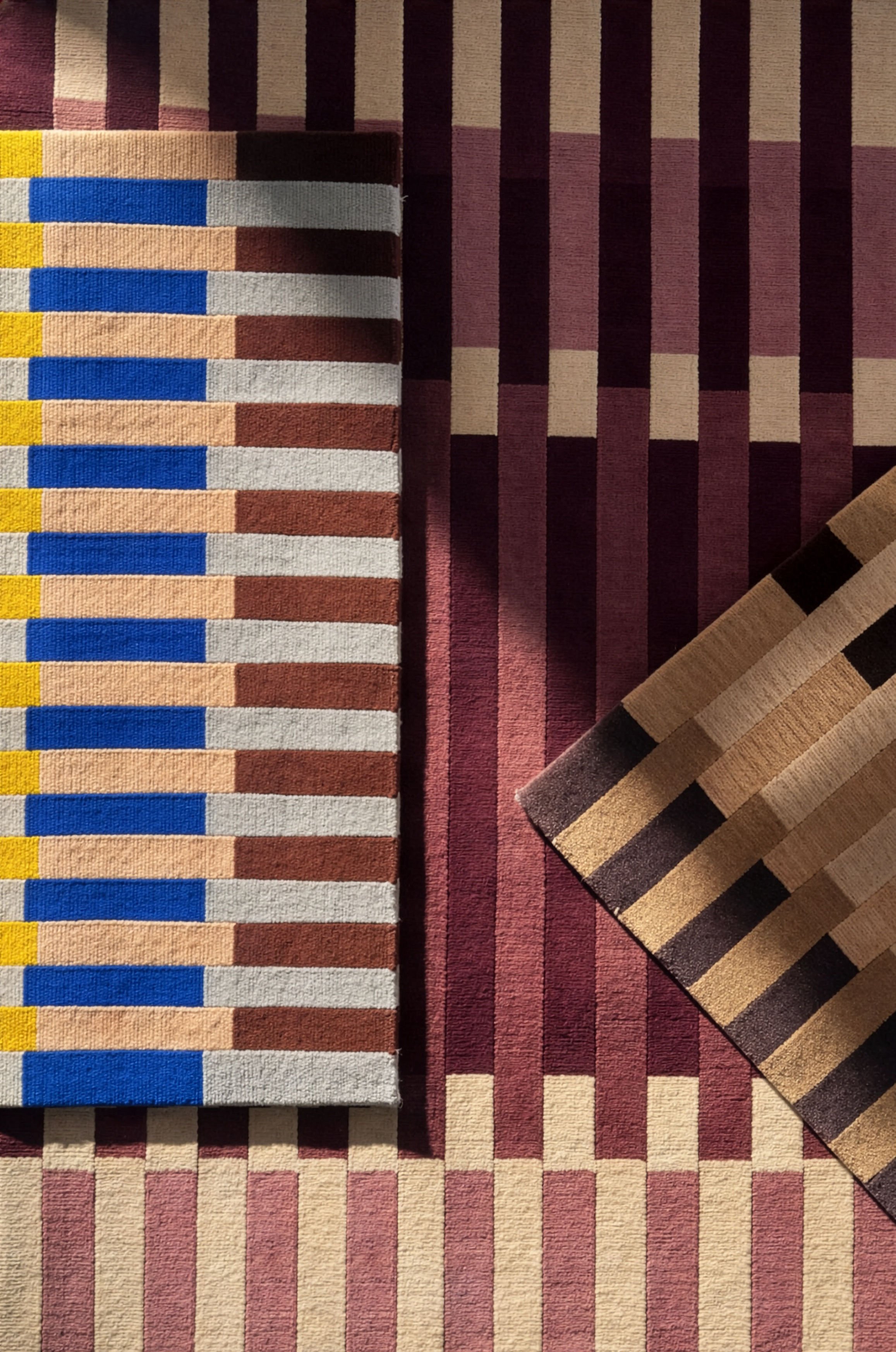
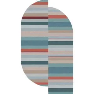
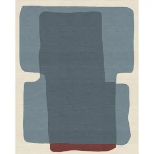
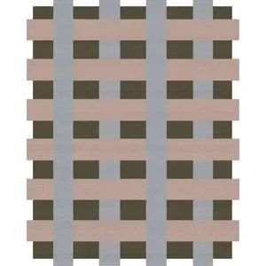
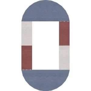
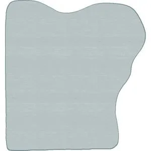
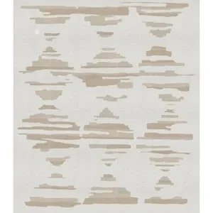
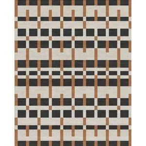
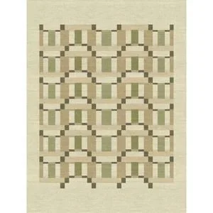
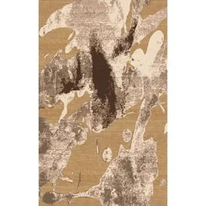
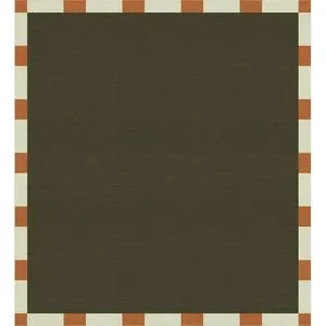
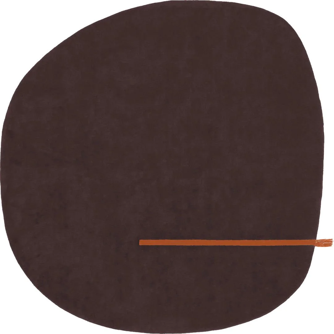
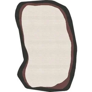
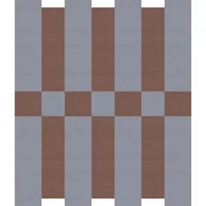
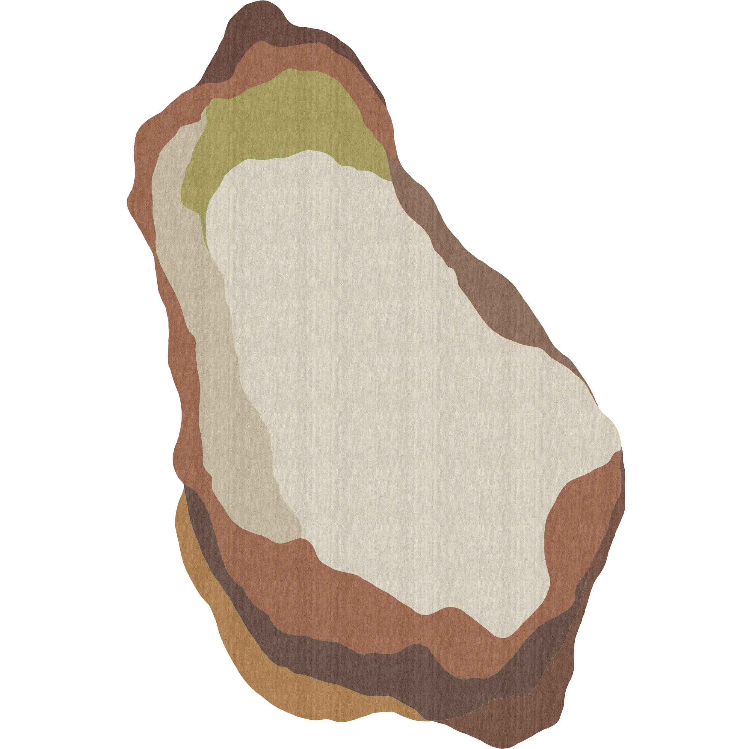
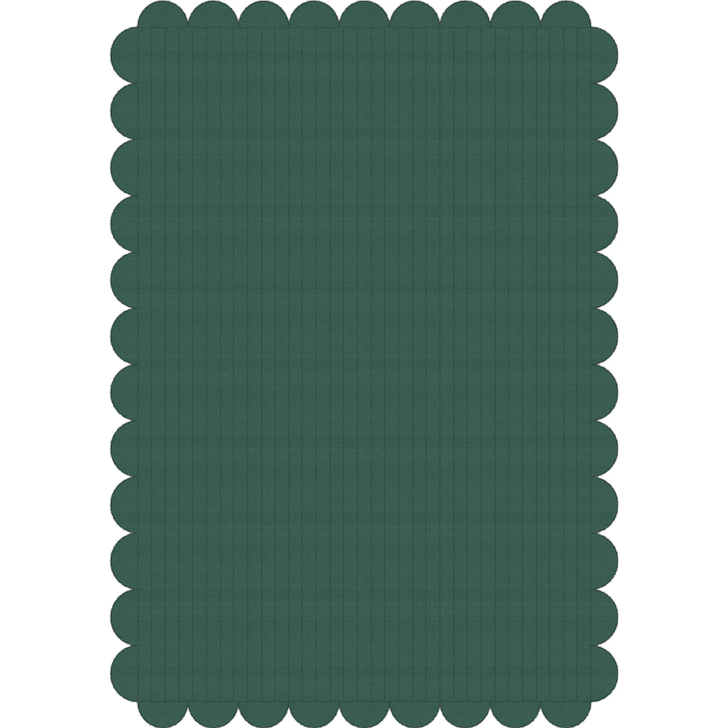
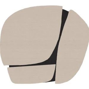
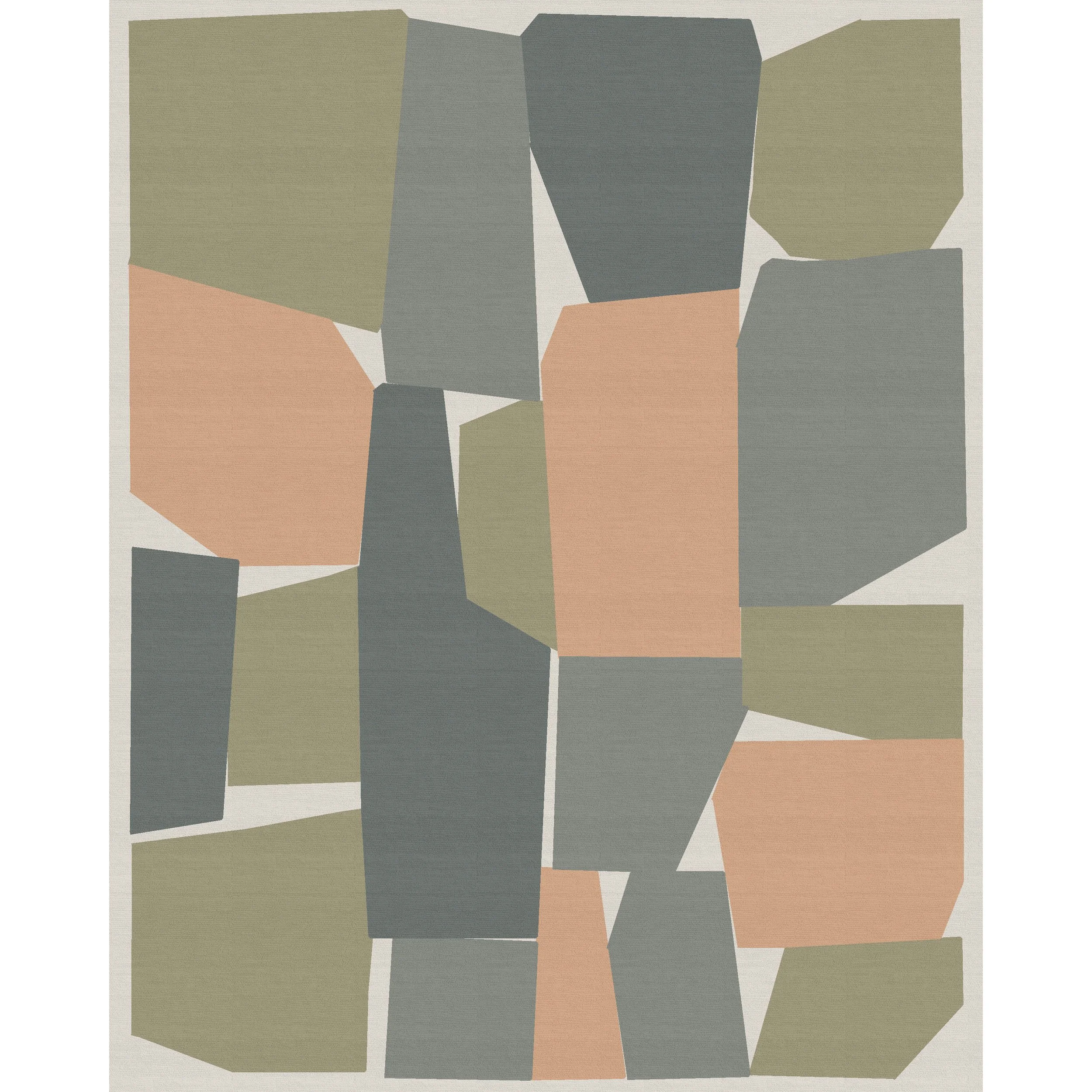
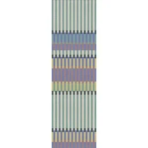
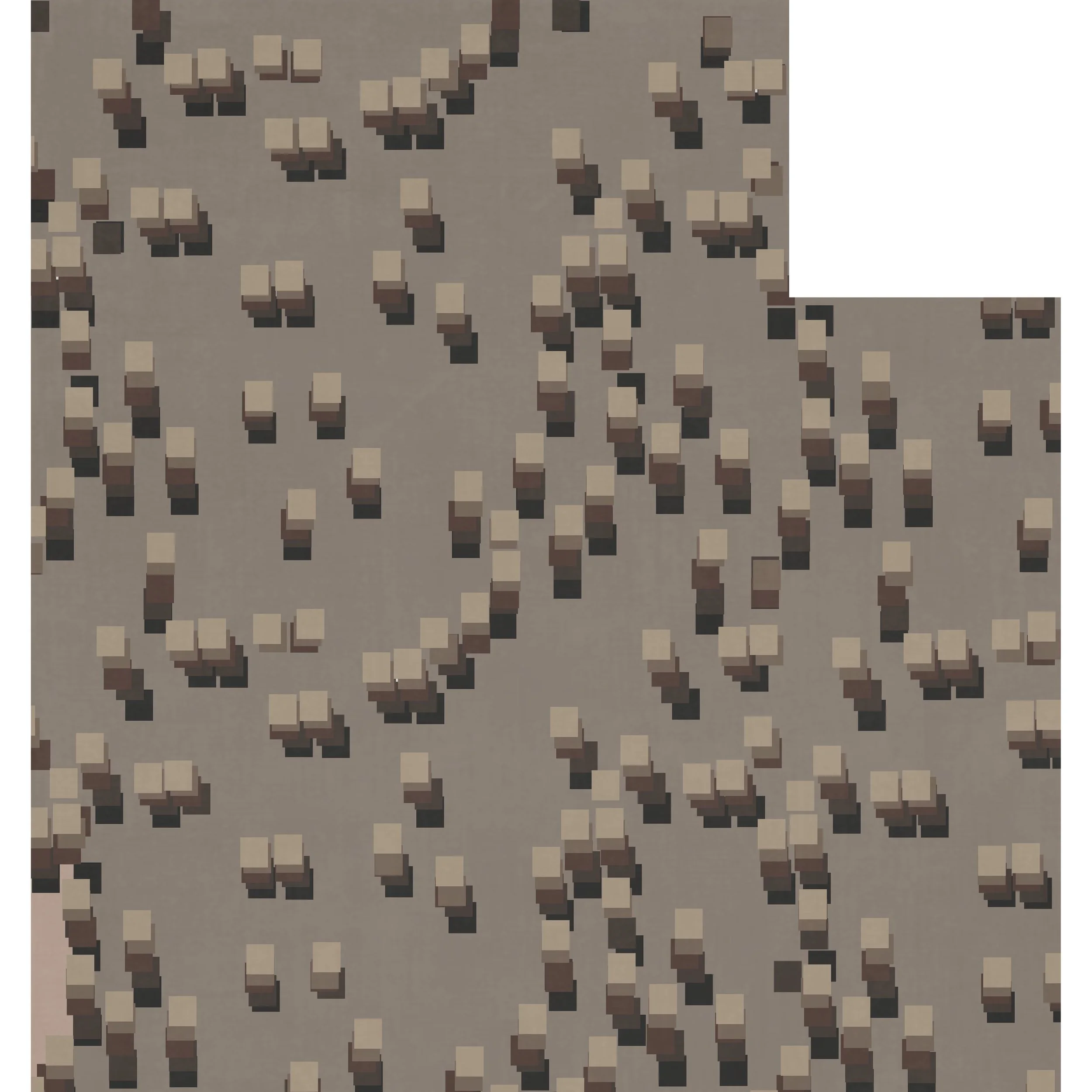
Loom capsule collection by Andrea Jae Studio and Supermarket Studio. In three colour options: Coast, Espresso and Plum.
If there is one thing Chantel and Ryan Ness of Supermarket Studio and Andrea Ewanchyna of Andrea Jae Studio have in common, it’s the belief that collaboration makes design stronger. Both studios are rooted in craft and process. Both are attentive to material, structure and the lived experience of a space, and both approach design as a dialogue rather than a solo act. This mindset is what brought them together to design a custom stair runner for a residential project. Ewanchyna conceived a runner that would become the visual anchor of the home.
“We collaborated with Supermarket Studio to make it happen,” she says.
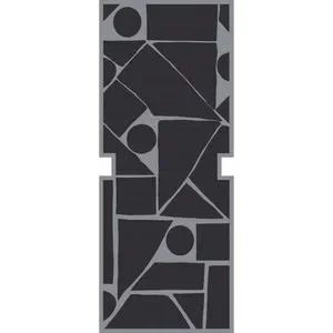
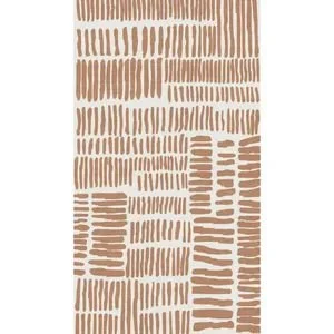
The stair runner design drew from Bauhaus textiles and architectural lines, resulting in a bold geometric pattern that honoured structure.
“That project was really rooted in design for purpose rather than design for esthetics, which is how Bauhaus came into the mix because ‘form follows function’ is their M.O.,” says Ewanchyna.
As Ewanchyna and Supermarket Studio refined the design, they realized it resonated beyond the client’s home. “We’d have random strangers coming up to us asking where they could purchase that rug,” says Ewanchyna.
Article content
Supermarket Studio received similar inquiries after posting progress images. The response led to the creation of the Loom x Andrea Jae Studio capsule collection.
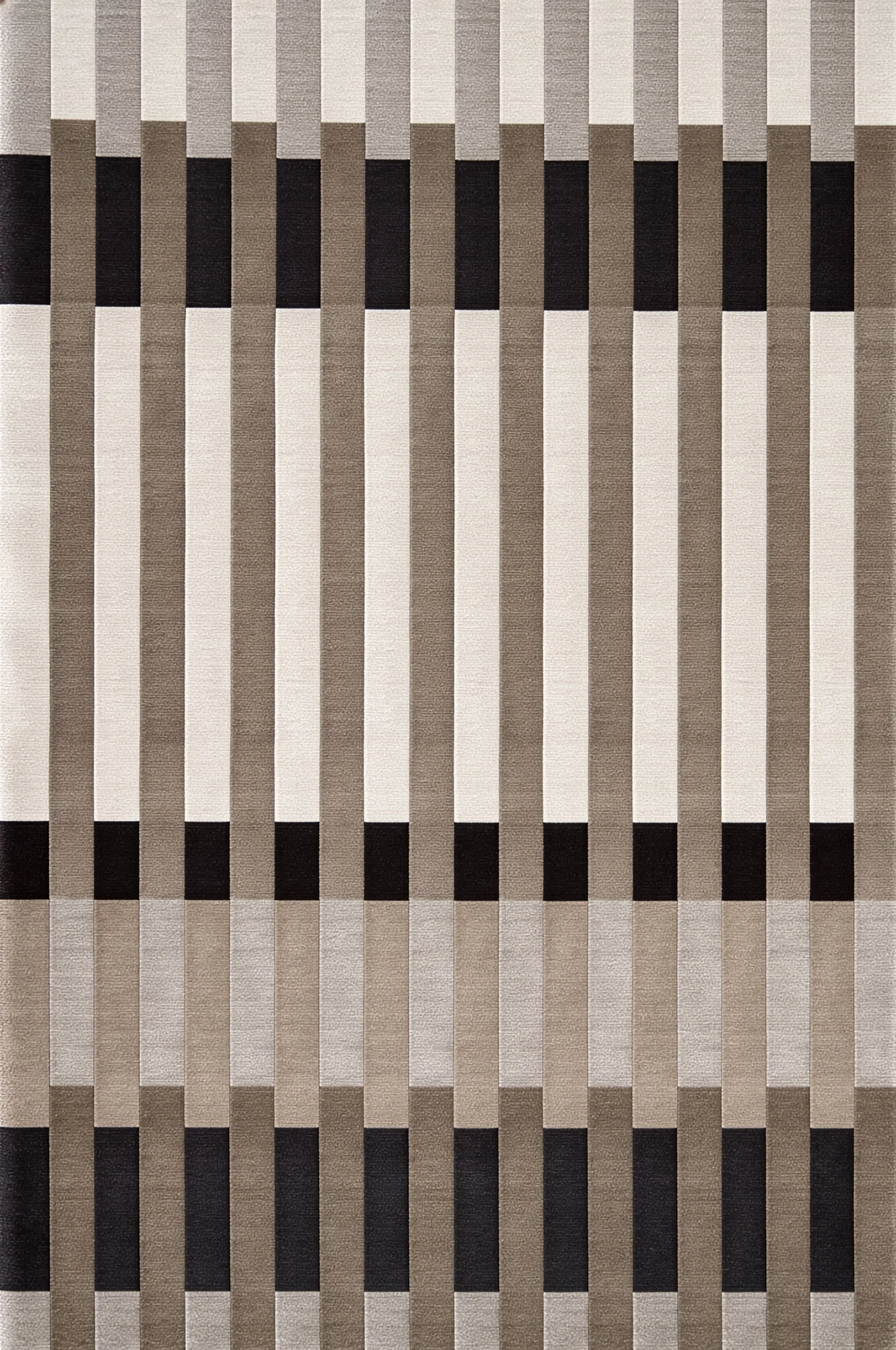
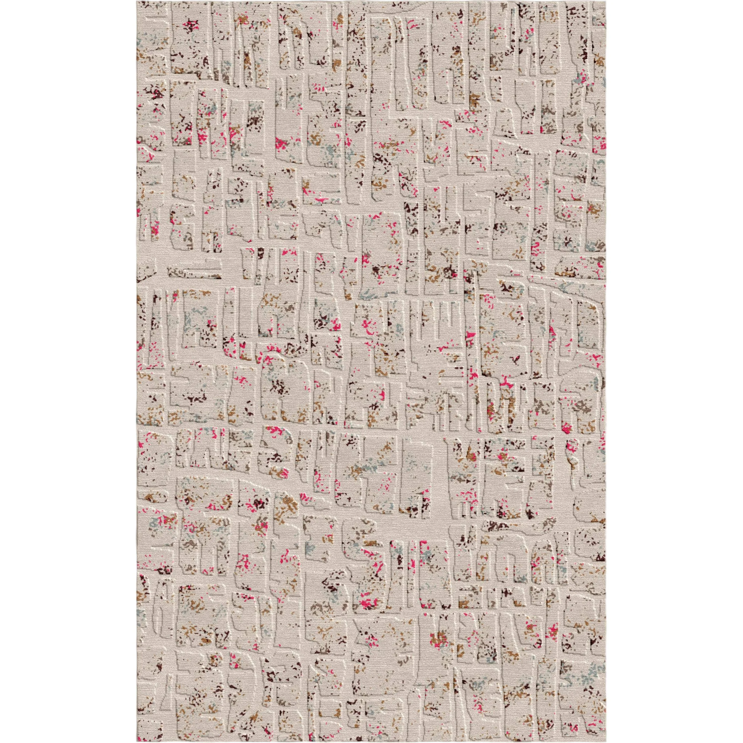
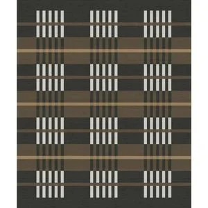
Loom rug by Andrea Jae Studio and Supermarket Studio, in Espresso.
The Loom collection
At the heart of the collection is a shared respect for textile history.
“Andrea and I were thinking a lot about weaving as a female-led tradition. Heritage and tradition have been carried forward through knowledge, repetition and making,” says Chantel Ness.
The influence of Bauhaus textile artist Anni Albers was intentional.
“We were inspired by Anni Albers’ idea of textiles as a dialogue between maker and material, which encouraged us to work with restraint and rhythm rather than decoration,” says Ness.
Bauhaus was a German design movement focused on function, geometry and the union of art and craft. In the Loom collection, Ewanchyna and Ness reflect that ethos by prioritizing structure and material over ornament, using disciplined geometry and the loom’s warp as a starting point to create purposeful, tactile rugs.
Colour, personality and comfort
The Loom collection features three distinct colourways, says Ness.
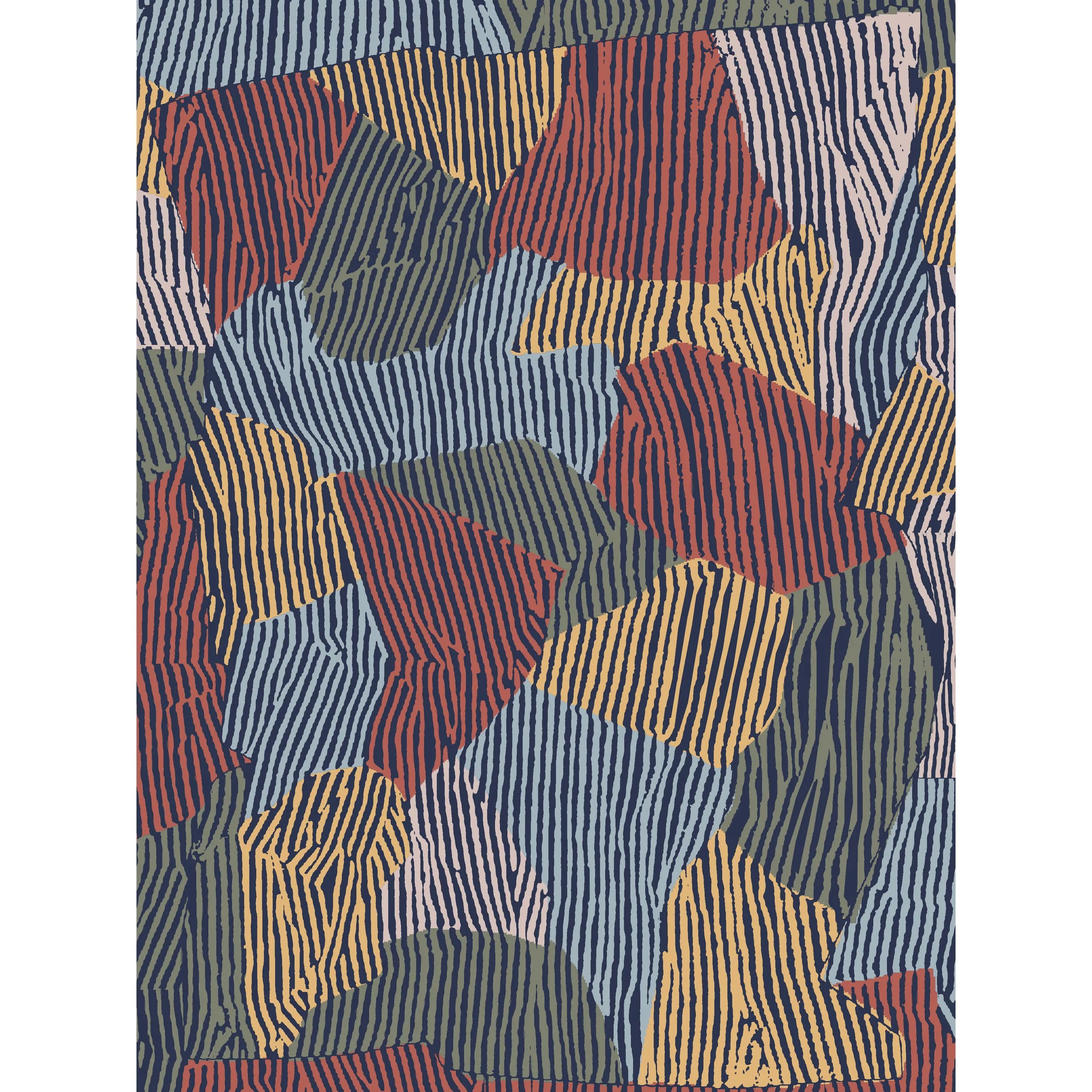
“‘Espresso’ is intentionally neutral and easy to live with, ‘Coast’ is a bit more fun, and ‘Plum’ nods to the colour-drenching trend happening in interiors right now. It was really about seeing how far the same design could stretch just through colour,” she says.
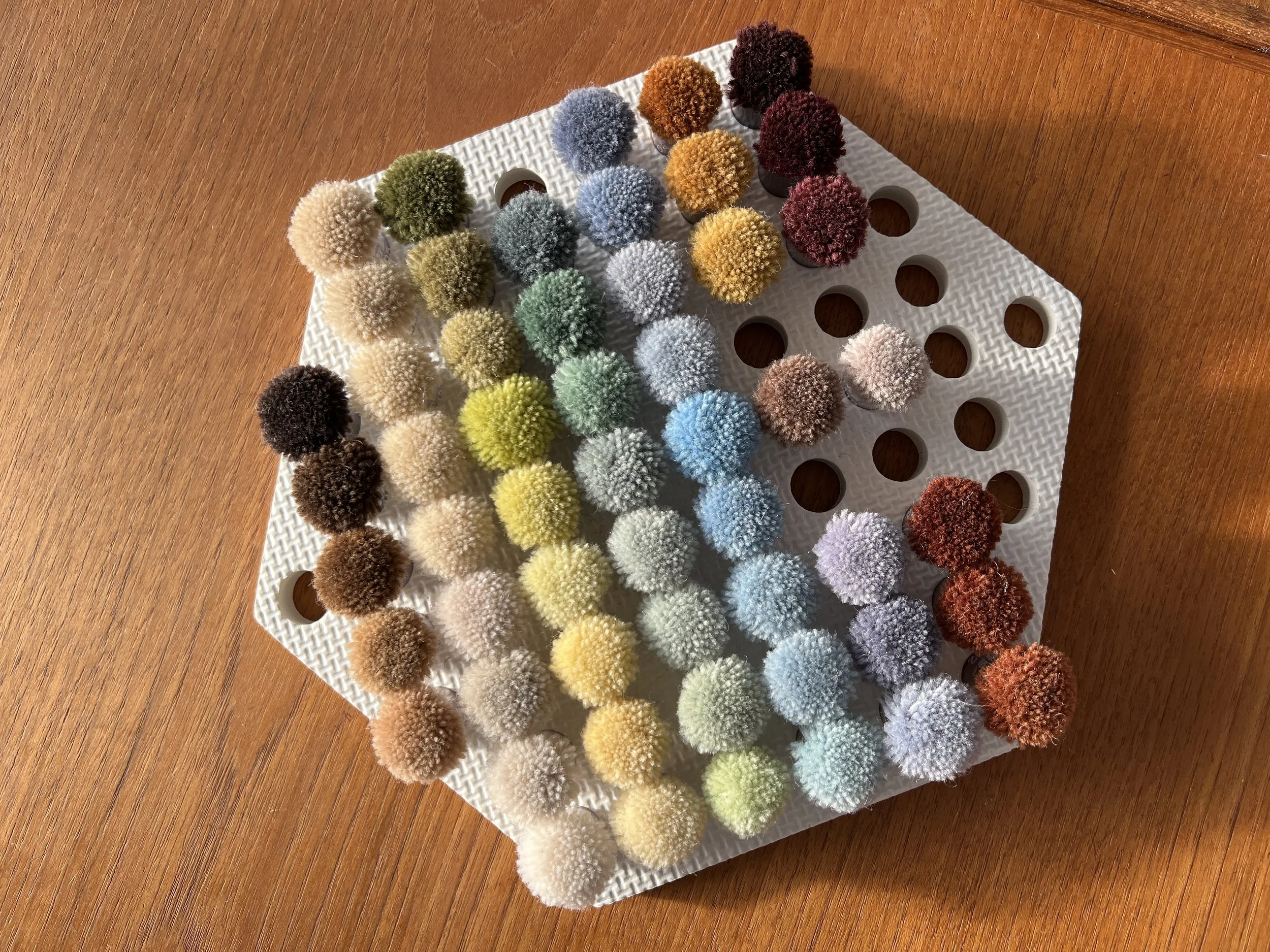
Developing those palettes required experimentation, says Ewanchyna. Supermarket Studio have hundreds of colours in their studio to select from.
Article content
What you think might work doesn’t necessarily translate, so the colour pompoms Supermarket Studio uses have become critical to the design process, says Ewanchyna. Their studio also helps with decisions on pile height, density and yarn spin so the rugs feel as good as they look.
West Coast modern esthetic
Article content
The Loom collection reflects a West Coast modern sensibility, says Ewanchyna.
Article content
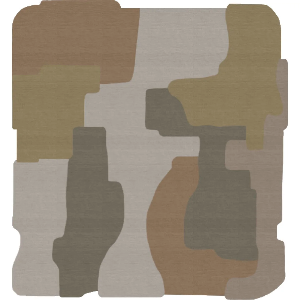
“In terms of design, West Coast modern means framing views of the natural world around us, whether that is through a vista in a window or creating a mood through layering of materials. There are lichens out there in our rainforest in these tones that we can tend to forget about,” she says.
Article content
Ultimately, she says, it’s about how these rugs make a space feel: “I want people to feel underfoot comfort! That’s the whole point of an area rug, isn’t it?! I also want them to feel like it’s a piece of art, but on the floor. I want them to know that each one of these rugs is handmade and therefore one of a kind.”
Custom Carpets: How does it work?
Every custom project begins with listening.
We consider the client, the architecture, the materials, the light, and the intention behind the space. Budget parameters and scale are established early, creating a clear framework for creative development.
From there, an iterative design process unfolds. Concepts are explored through renderings and layout studies. Colour direction is refined in dialogue with the surrounding palette. Fibre content, pile height, knot density, and construction method are carefully selected to align performance, texture, and aesthetic.
Each specification is deliberate.
Once the design is resolved, a strike-off is produced. A scaled sample that allows for final adjustments in colour, texture, and proportion. This phase ensures clarity and confidence before full production begins.
Upon approval, the finished piece moves into unique-batch handcraft production with our weaving partners. Throughout the process, communication remains direct and considered. We are translating design vision into a precisely executed, heirloom-quality carpet.
Structured, thoughtful, and exacting.
Thinking of exploring a custom carpet for your project?
hello@everythingissuper.com
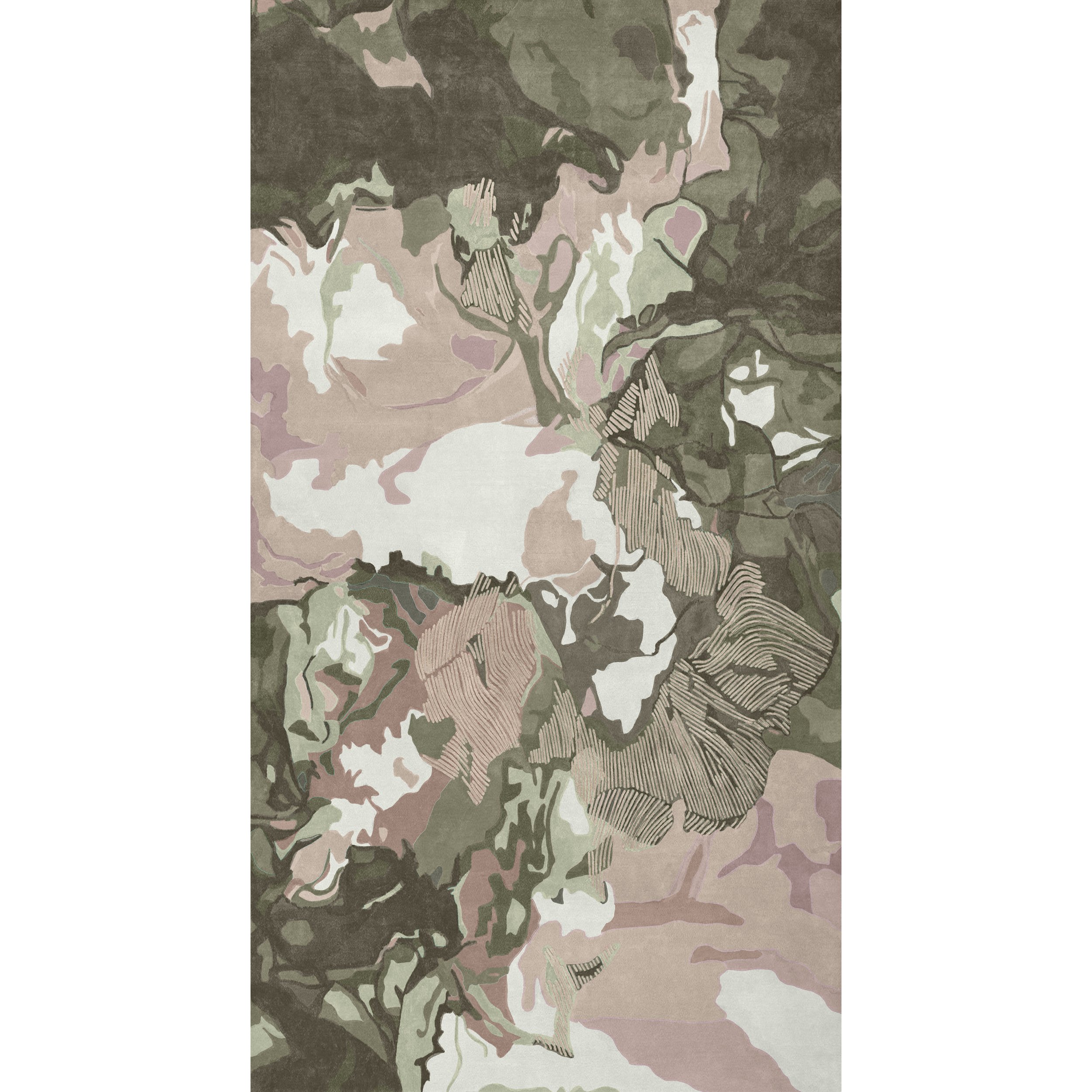
Design In’s & Out’s: 2026
OUT:
White Oak
Overly ‘Designed’ Spaces
Pantone Colour of the Year Predictions
Acid-Etched Mirror
Gold Finishes
High Gloss Stone
Curved Sofas
White Boucle
AI Generated
Clean-Girl Minimalism
Digital
Zellige
Accent Walls
“The Great Room”
(Purely decorative) Arches
IN:
Dark Wood
Emotionally Rich Spaces
Bold Colour Palettes
Coloured Glass
Nickel & Unlacquered Brass
Honed, Leathered & Flamed Stone
Wall-Mounted Furniture
Patterned Fabrics
Handcrafted
Authentic Maximalism
Analog
Hand-Painted Tile
Colour Capping / Colour Drenching
Dining Rooms
Barrel Ceilings
Colour Trends 2026
The hues colouring our world at Supermarket Studio this year.
The colours emerging across interiors right now reflect a cultural moment defined by a search for balance. We’re drawn to earthy browns, terracottas, and greens that ground us in stability and nature, softened neutrals that calm the senses, and dusty pastels that carry a quiet optimism. Deep moody shades like oxblood, aubergine, and denim add intimacy and depth, while sparks of ochre, mustard, and canyon orange bring moments of energy. Together, these palettes speak to the way people want their spaces to feel: safe and enduring, but also expressive and alive — a reflection of our collective need for comfort with room for joy.
Earth Pigments: ochres, siennas, umbers (tying to natural clay, wood, and stone).
Dusty Mid-tones: muted greens, mauves, and blues (popular in Scandinavian & Japanese interiors).
Retro Revival: ochre mustard, oxblood, rust — 1970s coming back in a modernized, softer way.
Pastel Naturals: buttercream yellow, parchment, sage — like sun-faded countryside tones.
Contrasts: light + dark pairings (cream + espresso, sand + brick, sky + oxblood) anchor palettes.
What’s Behind These Choices — What They Mean Culturally
These aren’t random. The colours are responding to what people are thinking / needing right now. Here’s how I see them connecting to the zeitgeist:
Comfort, Grounding, Stability
After years of upheaval (pandemic, climate anxiety, political instability, economic uncertainty), people want interiors that feel calming, anchored, rooted. Earthy tones + muted neutrals give that. They feel safe. Warm browns, terracottas, moss greens: all of that feels “grounded.”
Desire for Authenticity & Materiality
Natural materials, textures, finishes that show the hand or the process (stone, wood grain, imperfect finishes) are more valued. Partly a response to slick digital / virtual life. Colour that works with texture helps build that feeling.
Balancing Escapism & Restraint
The muted pastels + bold pops show people want both: colours that soothe, and bursts that excite. Not overwhelming, but expressive. It’s a middle path between “everything neutral” and “everything bright.”
Heritage & Nostalgia
There’s a collective turn to nostalgia: 70s hues, mid-century inspiration, vintage forms getting reinterpreted. Colour is part of that: the ochres, the mustard, the deep reds, wood tones. These evoke memory, comfort, identity.
Connection to Nature & Well-Being
Greens, earth tones, warmer yellows — these relate to plants, soil, sky, seasons. There’s a wellness angle: surroundings that feed calm, perhaps as antidotes to overstimulation in urban, digital life.
Personal Expression
Because people spent more time at home, home colour becomes more personal. Colour drenching, accent walls, statement pieces: they allow expressing mood or identity. It’s no longer just “neutral safe space” — more risk, more character.
Sustainability & Longevity
Choosing colours and materials that feel timeless, durable. The earthy, natural, heritage-inspired palette tends to age better. If you invest in a deep burgundy velvet chair or a well-finished wood table, that is something you want to live with. The colours reflect that mindset.
My Take: Where It Might Be Headed
Putting this all together, I think we’ll see these continuations and a few shifts in coming seasons:
More “quiet drama” — colours that aren’t screaming but still rich, moody, complex. Deep aubergines, damson, olive-teal, rusts with purple undertones.
More mixed materials that change how colour reads (matte vs gloss, fabric vs wood vs metal) so that the same colour can feel different in different contexts.
Accent colour as identity-signifier: people using a signature shade in small doses (lamps, cushions, furniture legs, backs) to make a mark.
And possibly a backlash or counter-movement: after warmth and earthy tones, a push for cooler, more unexpected tones: icy hues, minty greens, maybe more pastels again but unexpected mixes.